.u-header .u-sheet-1 { min-height: 70px; } .u-header .u-text-1 { margin: 12px auto 0 0; } .u-header .u-menu-1 { margin: -14px 0 0 auto; } .u-header .u-nav-1 { font-size: 1rem; } .u-header .u-nav-popup-1 { box-shadow: 2px 2px 8px 0 rgba(var(--grey-50-r),var(--grey-50-g),var(--grey-50-b),1); left: -10px; right: auto; padding: 20px; } .u-header .u-nav-popup-1 { box-shadow: 2px 2px 8px 0 rgba(var(--grey-50-r),var(--grey-50-g),var(--grey-50-b),1); left: -10px; right: auto; padding: 20px; } .u-header .u-nav-popup-1 { box-shadow: 2px 2px 8px 0 rgba(var(--grey-50-r),var(--grey-50-g),var(--grey-50-b),1); left: -10px; right: auto; padding: 20px; } .u-header .u-nav-popup-1 { box-shadow: 2px 2px 8px 0 rgba(var(--grey-50-r),var(--grey-50-g),var(--grey-50-b),1); left: -10px; right: auto; padding: 20px; } .u-header .u-nav-2 { font-size: 1.25rem; } .u-block-3d3b-17 { box-shadow: 2px 2px 8px 0 rgba(var(--grey-50-r),var(--grey-50-g),var(--grey-50-b),1); } .u-block-3d3b-17 { box-shadow: 2px 2px 8px 0 rgba(var(--grey-50-r),var(--grey-50-g),var(--grey-50-b),1); } .u-block-3d3b-17 { box-shadow: 2px 2px 8px 0 rgba(var(--grey-50-r),var(--grey-50-g),var(--grey-50-b),1); } .u-block-3d3b-17 { box-shadow: 2px 2px 8px 0 rgba(var(--grey-50-r),var(--grey-50-g),var(--grey-50-b),1); } .u-header .u-text-2 { background-image: none; font-weight: 400; margin: -19px auto 12px 0; } @media (max-width: 1199px) { .u-header .u-menu-1 { width: auto; } .u-header .u-text-2 { margin-top: -19px; } }
Thomas Binder
Home of Cycling

How it works

Duis aute irure dolor in reprehenderit in voluptate velit esse cillum dolore

1
Share your designs

Sample text. Click to select the text box. Click again or double click to start editing the text.

more
2
Development

Sample text. Click to select the text box. Click again or double click to start editing the text.

more
3
Provide feedback

Sample text. Click to select the text box. Click again or double click to start editing the text.

more
4
Launch website

Sample text. Click to select the text box. Click again or double click to start editing the text.

more

We have successfully managed projects since 2002

Sample text. Lorem ipsum dolor sit amet, consectetur adipiscing elit. Praesent sapien lorem, finibus sed maximus dictum, sodales eget dui. Nullam aliquam diam ut est eleifend, et molestie erat rutrum

Image from Freepik

Learn more

We offer a complete design service

Sample text. Lorem ipsum dolor sit amet, consectetur adipiscing elit. Praesent sapien lorem, finibus sed maximus dictum, sodales eget dui. Nullam aliquam diam ut est eleifend, et molestie erat rutrum

Learn more

Brand, experiences and radical collaboration

Sample text. Click to select the text box. Click again or double click to start editing the text.

Image from Freepik

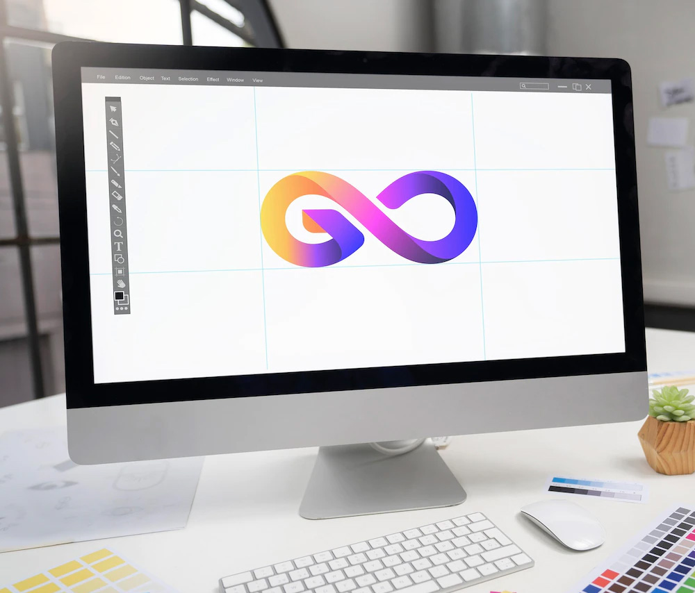
Creating the world's first community driven superbrand. Massa tincidunt nunc pulvinar sapien et. Ante in nibh mauris cursus mattis. Pellentesque elit ullamcorper dignissim cras tincidunt lobortis feugiat vivamus at.

Translating 100 years of service into a digital future

Duis aute irure dolor in reprehenderit in voluptate velit esse cillum dolore eu fugiat nulla pariatur. Excepteur sint occaecat cupidatat non proident, sunt in culpa qui officia deserunt mollit anim id est laborum.

contact us

Images​ from Freepik

 Call Us

1 (234) 567-891,
1 (234) 987-654

 Location

121 Rock Sreet, 21 Avenue, New York, NY 92103-9000

 Hours

Mon – Fri …… 11 am – 8 pm, Sat, Sun  …… 6 am – 8 pm

We turn your design into a live Webflow project.

Duis aute irure dolor in reprehenderit in voluptate velit esse cillum dolore eu fugiat nulla pariatur. Excepteur sint occaecat cupidatat non proident, sunt in culpa qui officia deserunt mollit anim id est laborum.

Get started with a free quotation

Thank you! Your message has been sent.
Unable to send your message. Please fix errors then try again.
.u-footer { background-image: url("http://thomasbinder.eu/images/nicepage-images/3b09e49584f392c48d7046ea654ff364.jpg"); background-position: 50% 50%; } .u-footer .u-sheet-1 { min-height: 250px; } .u-footer .u-layout-wrap-1 { margin: 40px 0 0; } .u-footer .u-layout-cell-1 { min-height: 123px; background-image: none; } .u-footer .u-container-layout-1 { padding: 20px 30px; } .u-footer .u-text-1 { margin: 10px 0 0; } .u-footer .u-text-2 { margin: 18px 0 10px; } .u-footer .u-layout-cell-2 { min-height: 123px; } .u-footer .u-container-layout-2 { padding: 20px 30px; } .u-footer .u-text-3 { margin: 10px 0 0; } .u-footer .u-text-4 { margin: 18px 0 10px; } .u-footer .u-layout-cell-3 { min-height: 123px; } .u-footer .u-container-layout-3 { padding: 20px 30px; } .u-footer .u-text-5 { margin: 10px 0 0; } .u-footer .u-text-6 { margin: 18px 0 10px; } .u-footer .u-line-1 { transform-origin: left center 0px; height: 2px; margin: 22px auto 0; } .u-footer .u-text-7 { margin: 30px 20px 25px; } @media (max-width: 1199px) { .u-footer .u-layout-wrap-1 { margin-right: initial; margin-left: initial; } .u-footer .u-container-layout-1 { padding-left: 25px; padding-right: 25px; } .u-footer .u-text-1 { position: relative; } .u-footer .u-text-2 { position: relative; } .u-footer .u-text-3 { position: relative; } .u-footer .u-text-4 { position: relative; } .u-footer .u-text-5 { position: relative; } .u-footer .u-text-6 { position: relative; } .u-footer .u-line-1 { margin-right: initial; margin-left: initial; } .u-footer .u-text-7 { margin-left: 16px; margin-right: 16px; } } @media (max-width: 991px) { .u-footer .u-container-layout-1 { padding-left: 30px; padding-right: 30px; } .u-footer .u-text-7 { margin-left: 13px; margin-right: 13px; } } @media (max-width: 767px) { .u-footer .u-sheet-1 { min-height: 480px; } .u-footer .u-layout-wrap-1 { width: 394px; margin-top: 37px; margin-right: auto; margin-left: 73px; } .u-footer .u-container-layout-1 { padding-left: 10px; padding-right: 10px; } .u-footer .u-layout-cell-2 { min-height: auto; } .u-footer .u-container-layout-2 { padding-left: 10px; padding-right: 10px; } .u-footer .u-layout-cell-3 { min-height: auto; } .u-footer .u-container-layout-3 { padding-left: 10px; padding-right: 10px; } .u-footer .u-line-1 { margin-top: 25px; margin-right: initial; margin-left: initial; } .u-footer .u-text-7 { margin-left: 9px; margin-right: 9px; } } @media (max-width: 575px) { .u-footer .u-layout-wrap-1 { margin-right: initial; margin-left: initial; width: auto; } .u-footer .u-text-7 { margin-left: 6px; margin-right: 6px; } }